The relative distribution of the traded volume
Every experienced trader knows that the more information is taken into account, the more accurate the analysis will be.
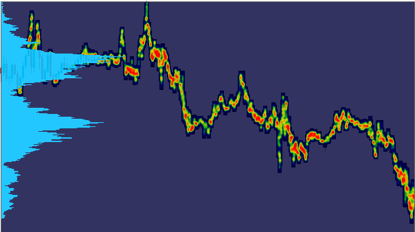
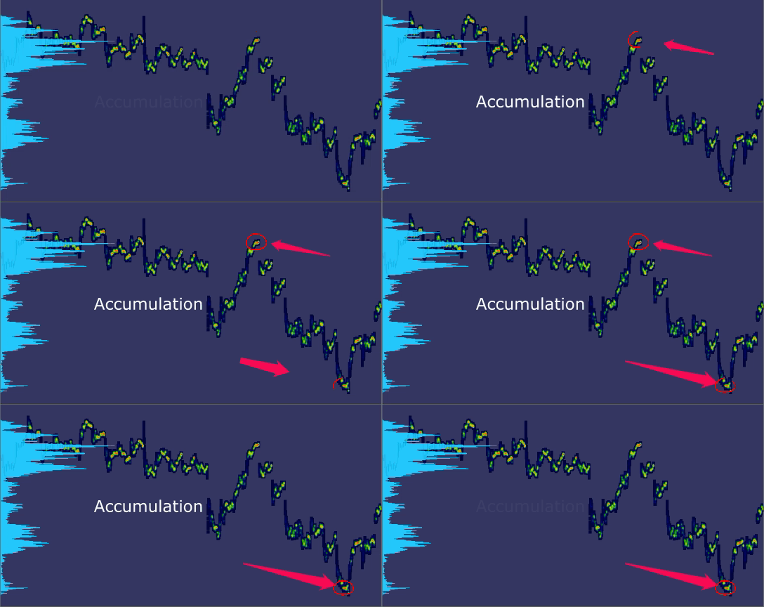
So, it would not be bad to see not only the profile (histograme), but also how the volume is distributed along the price movement. This is what a heatmap can show – the relative distribution of the traded volume. After simple experimentation, you can find that each trading instrument has its own “characteristic” way of distributing volume. For example, the figure shows that gold has a visually even distribution, but the Nvidia stock is moving at relatively low volumes, “without resistance” so to speak.

В Distribution of gold is “fatter” than NVIDIA

NVIDIA accumulation heatmap (before the price reversal)
And only at the end of the wave movement, the accumulation of volume begins, as a result of which the price slows down. This is a good point on the chart, which can be considered as a place for a price reversal. Naturally, the analysis must be carried out using other features, such as ATR, for example.
What to do with “fat distribution”?
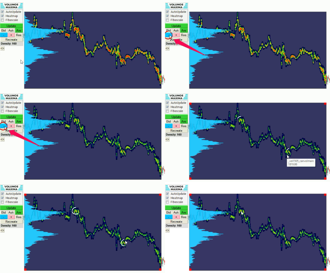
As shown in the image above, the volume distribution chart for gold looks “bold”. This makes it challenging to identify the most critical point accurately. However, this can be easily resolved by adjusting the intensity coefficient used to draw the heatmap. By reducing the coefficient, you can display the point of maximum volume accumulation more prominently, making it easier to identify potential areas for price reversal or support/resistance levels.

Decrease “fat distribution”
OK, that’s all well and good, but what about realtime?
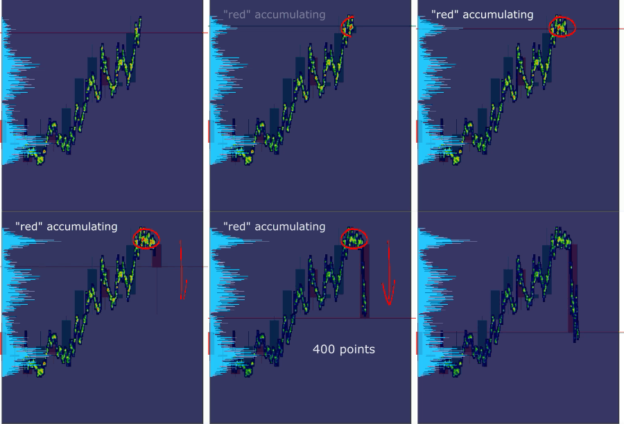
This is a very good question! Of course, in history everything always looks great and simple. But can it be used in real-time when trading? Of course you can. The peculiarity of the heat map is that after setting the coefficient, the display gradient does not change. And this will allow you to “catch” the point of accumulation during the real price movement, when a reversal or a breakdown can occur. On the map, this point will receive red color as the volume accumulates. And this moment can be considered as a signal to open a deal, depending on the context.

Realtime accumulating
Conclusion
In short, using a heat map, you can estimate “how many units of volume are spent to change the direction of price movement.” By analyzing different sections of the chart, you can determine the level of this “climax” value. And by adjusting the gradient, you can wait for the expected level of accumulation, which will appear as a “red spot” on the map. And based on this, make a trading decision.

0 Comments